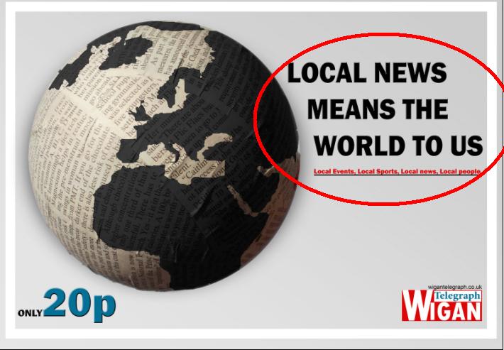
NEWSPAPER POSTER


 Firstly my logo, i noticed that most logos have the main word in a bold large text with the smaller word above it in either a sans-serif font or just a smaller block font. I also noticed that alot of newspaper logos have a block of colour behind them, i liked this idea as it rounds them off as a logo rather than looking like a headline for an article....

 This is an existing newspaper of what i modeled my front page around. I followed all of the conventions such as the logo in the top left corner, an advertising banner underneath the logo, a banner advert at the bottom of the page, and a story next to the logo
 The main reasons I decided to stick with normal conventions for my front page was the fact that i like the layout of the articles, having a main image with a large headline underneath it and a small section of the story to the right. I also liked the feature of the sub-story along the left hand side of the page, this isn't a regular convention of local newspapers, however i felt that it looked effective and brought another interesting aspect to the page enticing more than one audience.

This small video shows how my radio advert both challenges and follows conventions.


This small diagram shows how i used fonts to make my products recognisable + link.