When Creating my logo which was the first thing i created for my project i decided on a colour scheme which i would keep as a runinng theme through my main and ancillary products. I chose blue red and white for a number of reasons such as the fact that these are regular colours used in existing newspapers and also that these colours are bright and will stand out.


I carried on my colour scheme when thinking of layout ideas for my poster. I did this so that my products link clearly in an obvious way so that readers will always know when something by this company is released.

This small diagram shows how i used fonts to make my products recognisable + link.
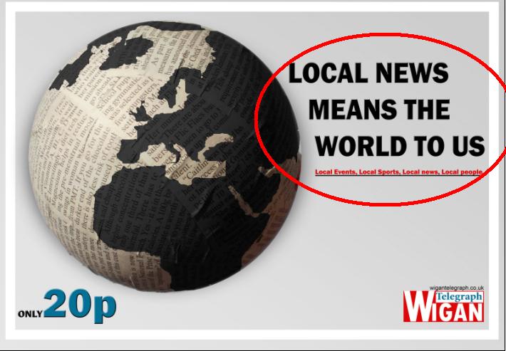
I chose a slogan for my products as another way to make them link which was 'local news means the world to us' i noticed that this was a regular feature of other newspapers and brands as a way to make them easily recognizable. I included this slogan in my radio advert aswel as my poster making them link clearly. In my radio advert i got my actor to whisper my slogan seperating it from the rest of the advert, therefor making it more clear that it's my slogan as listeners will have to listen more carefully to hear it so it will stick in their head for when they see the poster. I also decided to add the words 'local events, local sports, local news, local people' to my radio advert just to make it that more recognizable.
No comments:
Post a Comment